Oh Snap
Oh snap: An exclamation of dismay or disbelief, surprise, or joy.
The IPO of Snap—apparently a "camera company"—was the biggest news in financial markets last week. The sceptics are many, mostly emphasizing that Snap is loss-making and that its valuation based on forward earnings—never mind trailing earnings of which there aren't any—is ludicrous. The market begged to differ, though. Snap was introduced to investors at $17 a share, but immediately traded at around $24 before closing at $27, up a cool 58%, at the close on Friday. Bloomberg editor, and FinTwitter extraordinaire, Joe Weisenthal stated the obvious when he remarked that:

Indeed. I don't plan to invest in Snap and I must admit that its valuation is beyond my comprehension. I wouldn't call it dismay, but certainly disbelief. It wouldn't be the first time that fundamental investors were wrong about a tech unicorn, though, and it won't be the last. Matt Levine keeps his cool, and does a good job explaining the ins and outs of the story.
Looking for an excuse to sell
The uproar over the Snap IPO is a good metaphor for the growing disdain in some parts of the market towards the ever-rising stock market. I explored the uber-bearish meme here, and it remains strong as ever. The bears have thrown everything at the market; extended valuations, stretched technicals, a looming "Trump disappointment", a hard landing in China, or a breakup of the Eurozone. The louder their objections, though, the stronger the rally has become. I have found myself in a similar trap since Q4, when my models started to suggest that I should fade the rally in equities. It has been a costly position in terms of relative performance, but at least I haven't suffered the slings and arrows of those who have been short outright.
Bears will hope that the tide is turning in their favour, though. Volatility has crept higher, and the adage that "nothing goes up in a straight line forever" also appears apt at the moment. The S&P 500 was up 6% in the first two months of 2017, a hefty 36% annualised, and it isn't a huge leap to conclude that this momentum won't be sustained. But this piece of information alone isn't a good market-timing tool. The chart below shows previous occasions since 2000 when the S&P 500 was up more than 25% annualised in the first two months of year.

I was actually surprised to see that this hadn't happened once in the bull market from 2002 to 2007. It has occurred three times since 2008. In 2011 and 2012, equities did eventually drop sharp after their strong start to the year, but it 2013 the elevator kept on going up. Nevermind the fact that sample size of three is not statistically significant, the idea that the market must falter because it has gone up a lot isn't really a good argument. Naturally, if you want scary charts, there are plenty to choose from. The following chart shows the Rydex bulls-to-bears ratio, which is sporting an ugly double-top, consistent with the peak before the market swooned in the beginning of 2016.

But this chart also is difficult to interpret as a market-timing tool. For starters, its behaviour in this cycle is completely different what happened between 2002 and 2007. This could be because of a change in methodology, but the main problem is that the ratio has been trending since 2008. That's an issue for an indicator, which is supposed to give its main signals as a function of mean-reversion to a constant mean. We see similar problems in other market-timing indicators. The end result, I think, is that these indicators probably don't tell us what we think they're telling us.
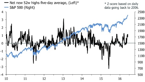
My medium-term/strategic valuation scores continue to suggest that I should fade equities and buy bonds, but my classic "timing" indicators—which all have a constant mean—do not indicate imminent danger for the market. The put/call ratio is uninteresting in both the S&P 500 and Eurostoxx 50, and breadth actually looks good. The next two charts show the smoothed index of net new highs on a 52-week basis well above zero for both indices.

The index in Europe looks particularly strong, which I suspect is mainly financials have started to stretch their legs a bit. This isn't that odd mind. The headline stories about widening spreads between Germany and the rest of the EZ economies have completely neglected the fact that curves in France, Italy and Spain have steepened significantly. This is contrary to the panic in 2012, when curves inverted. So far, the ECB's forward guidance has proved a reliable anchor for front-end interest rates. Last week I voiced scepticism about the idea that investors pile into EZ equities to relatively low valuations. All the quality in Europe simply isn't cheap, and no amount of charts with relative valuations to the U.S. can change that. If financials get going, though, headline equity indices in continental Europe will fly.
That flattening feeling in U.S. bonds
By contrast, the yield curve in the U.S. has flattened as markets have digested the fact that the Fed is about to move. This is despite the ongoing obsession with the Trump reflation trade, in which fiscal stimulus pushes U.S. GDP growth to above 3%. TMM's Leftback has been on top of this story, and his recent missive is a good read. To be fair, LB presents a slightly different version of the world than I do. My story suggests that the curve is flattening because markets are discounting that the federales will kill the recovery. For LB, the reflation trade simply does not sound convincing full stop.
"Our underlying rationale for entering the trades in medium-term US bonds can be summarized as follows: inflation is low, and it’s going to remain low. How so, with US equity markets seeming to make new all-time highs every five minutes and President Trump touting Yuuge Tax Cuts and to Make America’s (infrastructure) Great Again? We would argue that US wage inflation remains almost non-existent, the recent spike in oil prices will be transitory due to the continued global oil glut, and the “base effect” of last winter’s low oil prices is about to disappear from y/y inflation data. We therefore propose that the Fed is likely to hike only once this year, or at the most twice, and this bolsters our faith that the belly of the curve (5-7y) will not move beyond the 2% seen recently, and in fact may well move a lot lower than 1.5%. This explains the renewed bid for BOND."
The flattening curve in the U.S. implies that the second part of my story—outperformance of defensives and buying bonds—is looking better. The first chart below shows that bond returns have started to turn up, consistent with my valuation score. The second shows a little, but significant, kink in the chart of cyclical vs defensive equity performance. I think a further reversal here will be one of the main stories this year.


The continuing outperformance of financials in the U.S. is particularly interesting this respect. I have a lot of sympathy for the idea that less regulation will unleash animal spirits in this sector, but the flattening curve has forced me to take profit on my small position in WFC. No one went bankrupt from taking profit on a 30% gain! I might have moved too early, though. The first chart below updates the matrix of trailing returns and valuations of the MSCI World GICS 1 sectors. Financials have come a long way for sure, but they remain attractive based on valuations. I am also surprised to see that insurance remains in the upper left corner, signalling relatively poor trailing returns, and attractive valuations. If this is true, it suggests that the Q4 breakout in the headline insurance index, second chart, will extend further this year.


That's all well and good, but as long as the curve is flattening I can't see much merit in chasing the rally in financials. Healthcare, on the other hand, has re-asserted itself, and I am warming to telecoms too. But industrials and materials look desperately expensive to me, and I think investors will get badly burned in cyclicals if they assume a continued rally just because the White House promises milk and honey. To square the circle, it is often said that outperformance of defensives and flatter yield curves, in the U.S. at least, are harbingers of weakness in equities as a whole. But this is far from certain in a post-2008 regime. We have seen plenty of occasions since the crisis when benchmark equity indices and bonds rose together, and by extension where defensive sectors were leading the market. After all, where do you think the Spoos and Blues meme comes from?
Will macro data lead markets higher or astray?
Finally, the intense focus on macroeconomic data surprise indices and soft vs hard data hasn't dissipated. Surprise indices and survey data certainly continue to send a bullish message. The chart below is from Deutsche Bank, and shows global macro surprise indices and manufacturing PMIs going vertical.

The first pieces of Q1 hard data, though, haven't really lived up to expectations. The U.S. personal income and spending report in January showed that real spending fell at the beginning of the due to a big hit from utility services, due to warm weather, and month-to-month mean-reversion in auto sales. And in the Eurozone, January data for retail sales and car registrations also have been less upbeat than implied by survey data. It's early days, but the first round definitely appears have gone to the sceptics here. Of course, inflation data have been sizzling—which is perhaps why real volumes of spending have been hit—restoring the conundrum of how believable the reflation theme really is. As said in my previous post, sometimes we just have to wait for the data. The surveys have fired a significant shot across the bow; they point to solid hard data in Q1. We don't really have enough information to say whether they are right. Next week's industrial production prints in Europe will be watched closely for confirmation of surging PMIs. If the hard data proves underwhelming it will increase the risk that something is about to snap in markets.