Equity sector rotation chartbook Aug 2025 - Order is restored, for now
As I wait for the September update of the OECD leading indicators—producing data for July and August—I thought I’d introduce another chartbook I've been working on, this time focused on equity sectors. It replicates a variation of a Bloomberg function I used to rely on when I had access to a terminal, the Relative Rotation Graphs - RRG. Since transitioning to Macrobond as the main source of data in my day job, I no longer look at this tool as frequently as I’d like. To that end, I’ve built my own version using the SPDR S&P 500 sector ETFs, and the SPY along with the VEU, to capture the relative performance of sectors and global equities. The total return data comes from Investing.com, where I have a personal premium subscription.
This framework is effectively the asset allocation counterpart to the approach I’ve long used in my LEI analysis. That method divides data into four categories: low-and-falling, low-and-rising, high-and-rising, and high-and-falling. The first component—"low" or "high"—indicates whether the indicator is below or above its long-run average. The second—"falling" or "rising"—refers to the direction of change.
This can serve as a (very) rough-and-ready asset allocation model, informed by two somewhat competing perspectives. In a momentum-based approach, the investor stays overweight in sectors in the top-right quadrant—those with both positive relative returns and momentum—and underweight in the bottom-left quadrant, where both are negative. In a mean-reverting, or anticipatory, model, the assumption is that sectors rotate counter-clockwise over time. In this view, one would be overweight sectors in the bottom-right quadrant, anticipating a move to the top right, and underweight those in the top left, expecting a shift to the bottom left. That said, sectors sometimes rotate from bottom left to bottom right and back again—or between the top two quadrants—without completing a full cycle. This is to say, some time underperformers stay underperforming, and vice versa for outperformers.
A version of this framework using global sector factors would look quite similar—given the dominance of U.S. companies in most categories—though regional sector maps (i.e., sector factors excluding the U.S.) might present a different picture.
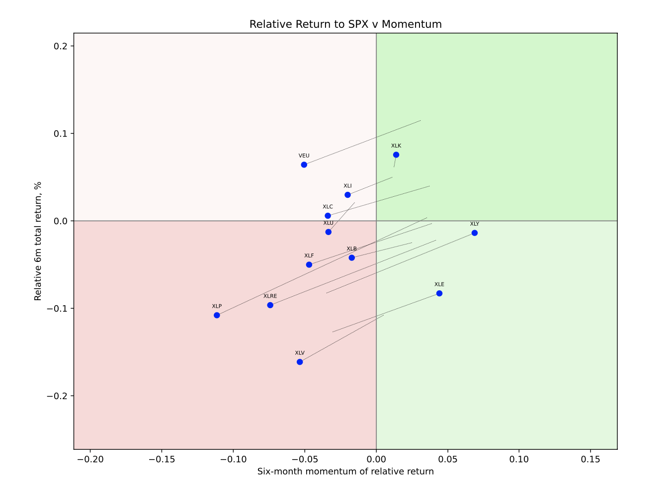
The August version of the chartbook can be found here. The chart below shows the rotation map for the end of August. It plots the six-month total return of the sector relative to the S&P 500 on the y-axis with momentum—the second derivative of the relative return—on the x-axis.
To refresh your memory of the SPDR equity sector ETFs, see here. But for the lazy ones among you, here is the list.
XLC - Communication Services
XLY - Consumer Discretionary
XLP - Consumer Staples
XLE - Energy
XLF - Financials
XLV - Health Care
XLI - Industrials
XLB - Materials
XLRE - Real Estate
XLK - Technology (Information Technology)
XLU - Utilities
VEU (not SPDR) - Vanguard FTSE All World ex US ETF
Three themes stand out to me relative to the prevailing macro discussion.
1. Order Is Restored: Tech Is Back in Front
The rebound in equities from the April lows has coincided with a clear and powerful resurgence of technology as the primary driver of market returns. In my six-month relative total return sample, technology is the only sector exhibiting both positive momentum and positive relative returns. In other words, the mighty U.S. tech firms—with their dominant market positions and AI-powered narratives—are once again carrying the weight for investors. As of the end of August, the sector’s six-month relative return stood just below 8%, still well off previous peaks, indicating further room to consolidate the outperformance.
2. Outperformance of Non-U.S. Equities Is Fading
A predictable corollary of tech's dominance is the fading outperformance of non-U.S. equities. That’s exactly what the data now show. While the VEU continues to outperform on a six-month basis, momentum has visibly deteriorated. This aligns with the fact that six-month outperformance peaked in late May at just under 15%—a 10-year high. To be clear, this is not a commentary on the prospect of a structural shift in global asset allocation away from the U.S.—which would favor non-U.S. equities beyond their six-month relative return—but simply a reflection of the data at this point in time.
3. Healthcare Lags, Utility Strength Is Fading, and Two New Rising Stars
It’s easy to get lost in the weeds of individual sector performance, but three trends are worth highlighting. First, healthcare remains the whipping boy, hurt by high-profile stock-specific issues—looking at you, UNH—and ongoing uncertainty around U.S. policy on domestic healthcare, drug pricing, and potential pharma tariffs. Nonetheless, the message to contrarian investors is clear; now is the time to allocate to beta in healthcare.
Second, if healthcare has disappointed as a traditional defensive "safe haven," utilities have done comparatively better. Their outperformance has been partly driven by the promise of rising margins and pricing power as AI drives up electricity demand. That tailwind may remain relevant, but performance data suggest the outperformance trend is now fading.
Finally, the chart above highlights two rising stars—sectors moving from the bottom-left to the bottom-right quadrant: energy and consumer discretionary. Of these, energy is arguably the more interesting. Consumer discretionary, heavily weighted toward AMZN and TSLA, likely reflects tech-adjacent flows to some extent, blurring the lines between sector-specific and factor-driven performance.