US Equity Sector Rotation Chartbook, May 2026 - The Unholy Alliance
The May 2026 edition of the US equity sector chartbook can be found here, with accompanying portfolio statistics here.
I have made quite a few changes to the chartbook since the last time I ran it. I have changed my data provider from Investing.com to SheetsFinance, which makes it much easier to update the spreadsheets feeding the Python scripts that generate this, and any other market-data chartbooks, that I am using. The data now reflect one-year trailing total returns with daily observations—approximately 250 trading days per year. I have also added a cross-correlation rotation matrix, which tracks shifts in sector correlations with IVV, along with chart plots of rolling correlation Z-scores.
Finally, I have included a portfolio optimization section at the end, accompanied by a linked Excel output. This section presents full-sample Tangent and MinVar portfolios, as well as their evolution over time, with the sample divided into five equally sized periods. In addition, I have incorporated a momentum risk parity component, which selects the five best-performing sectors and constructs a risk parity portfolio from them. Standard disclaimers apply. I am personally invested in equity sector ETFs, primarily through State Street global sector ETFs, and I may occasionally use this framework to inform my allocation decisions. However, the portfolios presented here are for background information only and do not constitute investment advice.
Future updates to this chartbook will include the incorporation of a dynamic risk-free rate into the portfolio construction, as well as more detailed analysis of cross-correlation dynamics and their relationship to broader market performance.
The Unholy Alliance
Two somewhat contradictory themes stand out in equities at present.
The first is a fragile equilibrium: market participants are reluctant to sell—let alone short—equities, for fear of being caught off guard by a sudden policy pivot (a “Trump TACO”) in the Middle East. Meanwhile, the global energy system is under strain and the macroeconomic outlook is sinking deeper into a stagflationary hold. With markets exerting limited pressure on the US administration to reverse course, negative outcomes that investors currently deem unlikely are becoming more probable.
The second theme is the apparent inverse relationship between equities and oil prices. This is evident from a casual look at daily market movements and reactions to headlines regarding developments in the Middle East. It suggests that energy stocks and the broader equity market—particularly technology—should also exhibit negative correlation. Yet, by several measures, energy and technology sectors are simultaneously acting as key drivers of the market’s resilience, helping equities continue to climb the wall of worry.
An unholy alliance, indeed.
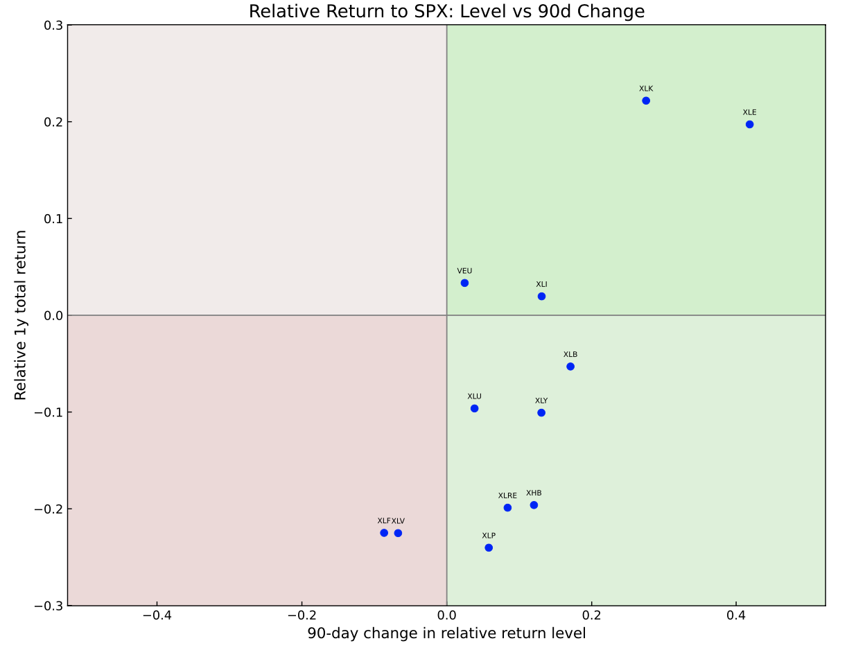
The chart above paints a clear picture of current market leadership, with XLK and XLE firmly in pole position, followed by VEU and XLI. These four sectors encapsulate the key themes driving US and global equities over the past 12 months.
Technology remains ever-present, supported by AI-driven growth expectations and generally robust business models, driving rising earnings, free cash flow and more recently investment, which is supposed to deliver future growth at the expense of eating into current free cash flows. This resilience persists despite what might be described as a “SaaS apocalypse,” in which AI threatens to cannibalise a subset of the very firms—primarily in software—that were expected to benefit most from, or leverage, the technology.
Energy’s strength is more straightforward, reflecting a slow-moving supply shock in global oil markets tied to the still-unresolved situation in the Strait of Hormuz. Recent developments suggest the US is now pledging to escort ships through the strait, a move that has drawn Iran’s ire. It is difficult to see a meaningful resolution emerging until President Trump sends the US navy home, declares (perhaps pyrrhic) victory, and leaves the broader international community to negotiate the restoration of commercial traffic with Iran.
As suggested in the “Unholy Alliance” theme, macroeconomic weakness or asset price declines outside the US are unlikely to materially shift the outlook. What matters is weakness in US equities or bonds, a sustained shift in inflation that forces the Fed’s hand—or some combination of all three. Until then, the slow-motion stagflationary shock remains intact.
XLI’s position in the top-right quadrant is driven largely by the continued surge in Caterpillar—the ETF’s largest holding—and, to a lesser extent, by strength in US defence stocks. In essence, industrials are leading the market higher as a “picks-and-shovels” play on both the AI boom and elevated US defence spending.
Finally, VEU’s position suggests that the rest-of-world trade still has some momentum, although its relative performance versus the S&P 500 appears to be fading. This likely reflects the view that the slow-burning macro shock stemming from a potential US–Iran conflict will impact the rest of the world sooner—and more severely—than the US itself.
The bottom-right quadrant—underperforming the market but exhibiting improving momentum (positive second derivatives)—is populated by sectors attempting to break into leadership. Closest are materials (XLB), utilities (XLU), and consumer discretionary (XLY), followed by consumer staples (XLP), real estate (XLRE), and homebuilders (XHB). Meanwhile, healthcare (XLV) and financials (XLF) remain firmly in the bottom-left quadrant.
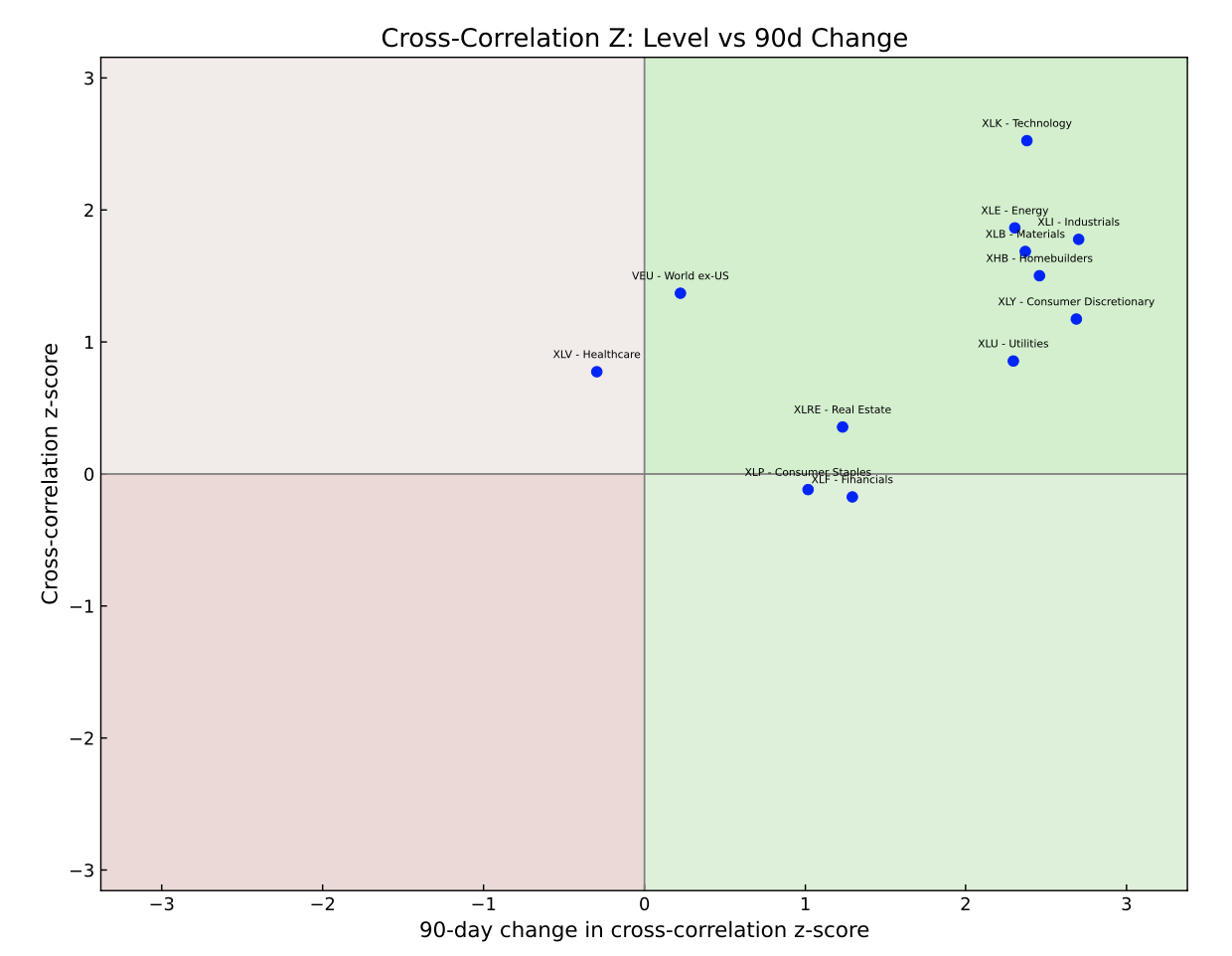
The summary chart above plots the cross-correlation Z-scores, which show that most sectors are exhibiting strong correlation to the market, relative to their historical correlation. It’s easy to get lost in the detail here, so I would leave you with one idea that stands out to me from these two charts; consumer staples. XLP is showing improving relative returns with a relatively low correlation, which is exactly the kind of exposure that can help portfolios otherwise exposed to an increasingly narrow rally, which most index-fund heavy portfolios invariably will be. In addition, if the US consumer upturn is now, relatively speaking, coming off the boil, especially factoring in higher inflation from rising oil prices, XLP might be a decent overweight here relative to the market portfolio.
As for the portfolio statistics, I will have more to say about this in future updates. For now, they hopefully give readers a flavour of how standard portfolio selection tools allocate to these sectors and crucially, how the weights change over time in this sample.